Showing posts with label color. Show all posts

Thursday, June 28, 2012

Happy Anniversary


"Happy Anniversary", original photographs
I was asked by my friend, Becca, to shoot a series of portraits of her and her
sisters as a surprise for her parent's anniversary.

These are the group photographs, plus some sentimental graphics. 

It was a joy, and here is my artist's statement for it (addressed to their parents).


Becca approached me about creating a surprise for your Anniversary. She and her sisters decided that they wanted to pose in a series of photographs, in order to show you how much they love your dedication to each other and to family. After talking to Becca, I decided that I wanted to help collaborate with her and her sisters to create a keep sake that you two and the whole family could have for years to come.
Through the photo shoot, Becca, Laura, Michelle, Jessica and I were hoping to surprise you two. I have known Becca for a few years now, and meeting and working with Laura, Michelle, and Jessica as well was an amazing experience. I decided that I wanted to come as close as I could to capturing the girls’ appreciation, love and dedication to you two through this series of photographs. Originally, we had decided to stage the photo shoot at Dan Daniels Park because of the natural scenery. However, the day we chose to do the photo shoot ended up bringing scattered showers and thunderstorms. We then decided to move the location to downtown because of shelter, in case of more showers. This ended up being a wonderful choice, as downtown has been a long-time symbol of history, loyalty, and appreciation. I realized afterward that downtown was a great parallel for a successful relationship because as you two know, a solid relationship requires a strong history with each other, unwavering loyalty, and appreciation and love. We used several locations for the photo shoot: the train yard, around the Science Museum, and Down Town doors. I wanted to frame the girls to create a simple photograph, so they could show their love and appreciation for you two. It was their idea to keep the photographs in color, and they are all unedited. I kept them unedited because I felt that reflected the genuine quality of the girls and of your family.

Wednesday, June 27, 2012

"Compassion Lost (with beginnings of Cubism)"


 "Compassion Lost (with beginnings of Cubism)", acrylics, water color, pen
(11 x 14)


This piece was created in order to express my feelings towards past relationships. 
 I made a man and a woman the subject of this painting. The man (right) is pictured
 offering a rose and crying to the woman (left). However, the woman is crossing her arms
with an angry expression on her face. I placed the image of the Golden Mean Rectangle
on top to show how this relationship cycles around and around.


This is my reason for creating this specific art piece; however, it is open to interpretation,
and, as always, you are free to take any meaning you want from it!


This piece will be on etsy.com with a price in a few weeks.
Let me know if you are interested in this painting.

 *All pieces come with a clear finishing coat over the original painting for protection. They also come with the title, and artist's signature on the back.

"Spring Time Pond"

"Spring Time Pond", Acrylics
(16 x 20)

I created this piece with a custom-designed stencil of an abstracted bumblebee. 
This piece was originally created to be a figure-ground study (where the subjects and
the background both neither advance nor recede and act as decorative space). However, as this piece evolved it turned more into an abstracted view of a pond.

The price will be posted on etsy.com in a few weeks.
Let me know if you have any interest in this piece!

*All pieces come with a clear finishing coat over the original painting for protection. They also come with the title, and artist's signature on the back.

Esty.com

Hello Everyone!

I wanted to let all of my blog followers and fellow bloggers
that I will be selling some of my art work on etsy.com soon!

Etsy is easy to navigate, and you can search for me on the site
by my e-mail, ella.bella7@gmail.com!

I really do love all of my blog follwers and supporters, so because
of your positive feedback, and interaction on my blog, I will
be posting all of the art work that I will be selling on here, first.

(so you can get a first look, and pick...contact me at my above 
e-mail if you are interested in any of them!)

Peace,

Ella Bella

Monday, June 11, 2012

A Falling Star, Portrait of Rashawn with Lana Del Rey

"A Falling Star, Portrait of Rashawn with Lana Del Rey", india ink, pen, crayon
I decided to draw a portrait of one of my closest friends, Rashawn. Rashawn is such an amazing person and friend, and I really am so thankful for having him in my life. This is a piece of the portrait that I drew him. I did not include the whole portrait because the portrait itself is a letter that I am mailing to him (and he hasn't seen it, yet! So the rest is a surprise!!). I included lyric from several different Lana Del Rey songs because Rashwan was the one who introduced me to her music.  It has been over a year since I have seen Rashawn, and I am proud of him for being himself and accomplishing many things! I plan to see Rashawn, again, soon, and I can't wait until then!

Tuesday, May 1, 2012

A Jump In Logic

"A Jump in Logic" acrylics, marker, cotton & nylon fabric.
My inspiration for this piece was the long history of the nautical star. The stories of how sailors and navigators relied on the stars for sailing and guidance was the first idea I worked with when planning this piece. I also learned that the nautical star is usually the decoration that is used to hide the metal rod that is installed in the sides of older houses-the nautical star holds the rod in place and keeps the house from falling apart. This stability that nautical stars hold was the idea that ended up becoming my final inspiration. I used complementary colors to make the stars stand out. This was the first time that I mixed fabric into the paint for the background. I tore nylon and cotton t-shirts and mixed them in with the black. I did this because I wanted to create a feeling of disorder and chaos, contrasting from the stars, which I wanted to make bright and stable. Thoughts?

My Four Mothers


"My Four Mothers", Mixed Media
This sculpture represents my four mothers: three extended, one biological. I wanted to create an homage to these women who have encouraged my creativity. Cindy, Teresa, KW, and my mom have all supported my pursuit of art. Not only have they supported me, but they have pushed me to ask, "What if..?" in my art throughout the years. The metaphor I worked with for this art piece was, "These four women have fueled my creativity as air fuels fire." The parts of this piece that holds significant symbolism are the candles and the flames. The candle on the left is taller because it represents my three extended mothers. I used scale to show how many people each candle represents (height); therefore, the candle on the right is smaller because it represents one person: my biological mother. I did not create the scale difference, in order to signify importance. I used scale variety to represent the number of people only. The two candles together represent a passage together, in which my mothers have created for me. This passage opens every time I see one of my mothers, and I am able to refresh my creative perspective through them. The flames are significant because there are hearts that I sculpted inside of the flame. Each heart represents one of my mothers.
I did not have any specific artist for inspiration in mind when I was creating this piece. However, while I was sculpting the flames, I realized that they were very surrealistic. I have always been attracted to the surrealistic movement, and I have always been drawn to Salvador Dalí's work.

Tuesday, April 10, 2012

Merging Realities


"Merging Realities", Acrylic, India ink, mat board

Hey kittens, sorry it's been a while since I've posted art work...it has been crunch time as far as the spring semester goes. This is one of my last pieces for Design II. And, guess what!? It's 2D & 3D, fun, hmm? I made a woman from simultaneous perspective with abstracted colours. I do not have any certain conceptual purpose behind this piece, but I do think that the overlapping hand came out more creepy than intended (she's going for my face!! ahh!!). Any comments? Peace out.

Monday, March 26, 2012

Pepper Logo

"Pepper Tat", original drawing, colour swatches
I originally drew this character as a food self-portrait (which can be found in the archive!), but my mentor, Mr. Henderson, wanted to create a car decal for his truck (or should we say a tattoo for his car?). I decided to redraw the original self-portrait, and give it more elements of Mr. Henderson, and base loosely off of Pepper Pots from Iron Man (which became the central focus for the piece!). Then, we abstracted the colours, and created a closed colour scheme, which became a better abstract representation of an actual pepper, as well. And! The decal has now been printed (Thank you Mr. Henderson), and I have a few sheets of the sticker...one currently resides on my laptop. Any ideas of where to put the others? 

Colour & Space: A New Series


Colour & Space Series original photography, graphic design
(T-B: Katie (awaiting title, ideas?), self-portrait, "The Innovator with Lana Del Rey"
Hey all you kittens! I know it's been a while since I've posted some art...but, stay assured, I have been busy creating it! The title is to-be-determined as of now because I have just started this series. However, I can tell you my inspiration that sparked this series: this series, like the pieces themselves, are a collection of several different concepts. Upon studying colour theory, my professor had the class watch scenes from Fantasia (still one of my favourite movies to this day). I was really inspired by Walt Disney's colour palette and selection-rewatching scenes from this movie reminded me what a masterpiece the movie was, and how much I have missed viewing it. This series has also been sparked due to the music I have been listening to-specifially Lana Del Rey (thank you Rashawn for introducing her to me!). I feel that her music is very layered-as my art work usually turns out to be. I am also aiming to better my skills of using space and perception in my works (studying this unit in class, now). And for now, that'll do, Pig.

Wednesday, February 29, 2012

Lost, partner art


"Lost" Partner art; original photographs, digital effects.
I've heard that young artists often spend their early years in art creating self-portraits. I can say that I definitely have done quite a few (as I'm sure you have noticed...:P). I have just generally found that using myself as a subject for my art is convenient, for starters-because you already have consent. But, on a deeper level, self-portraits are so much more than convenient-they are a way of figuring out who I am and expressively documenting who I am at that moment in time...which seems is always changing...

Friday, February 24, 2012

Vibrant Rose

"Vibrant Rose", original photograph, digital effects.
This photograph was inspired by a rose that was given to me a while ago. I took many photographs of it, and decided that I would hang it to dry. I took photographs of it as it aged. I decided to go back to one of the first photographs I took of it, and use it to reflect how this rose made me feel when it was first given to me.

Thursday, February 2, 2012

Love you, Mom

"Young Adulthood", original photograph with digital effects
Just having fun with this photograph, instead of doing other things that are productive...
I decided to title this one, "Young Adulthood" because it was inspired by a graphic in the Wall Street Journal. It was a comical picture of a teenager's brain, that I found very funny and accurate in a strange way. The article was about all of the things that occupy a teenager's mind, and the picture showed words, such as: "Angst", "Vroooom", and "Heartbreak". I decided to piece together my face in different values and colours (with different proportions) to show how this is such a transitional time in my life. It is a transitional time in many teenager's lives (and all young adults, too)-I wanted to portray the different sides of me that may develop or happen to be an influential part of who I am now. As for the background....that's ,"City-Scape Puddle Reflection" (thank you, Mom for helping me title it!).

City-Scape Puddle Reflection


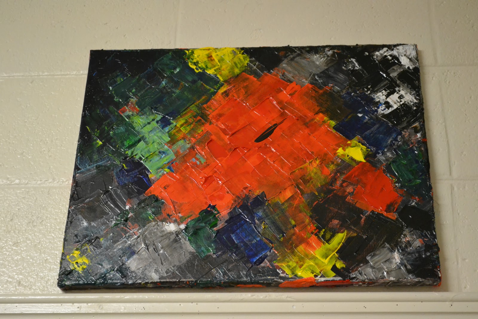
"City-Scape Puddle Reflection",acrylics on canvas
So...using the palette knife was awesome! This painting was the first time I used my palette knives, and it was so much fun. This painting took me three stages to complete. The goal for this painting was 1. to explore the texture effects that acrylics can create, and 2. to have fun. I had considered using Gesso to amplify the textural effects, but, instead, I decided to apply the paint in layers. My art teacher pointed out that I like working in layers. This isn't really something that I noticed until I stepped back and look at many of my works in a row. Intriguing? Seems so. Hope you guys enjoy this piece (I know I enjoyed making it...and having a mini photo shoot with it :P). Peace.

Sunday, January 29, 2012

Dancing through time


 Dance Studio Series, original photographs.
These are just a few moments that I captured with my D3100 while I was in the studio with some dancers from LC. I really enjoyed working with all the dancers-they were all very photogenic and talented. Top to Bottom: "Secrets", "Paris", "Criss-Cross", "Vinny". Shout out to Jen, Paris, and Vinny for letting me photograph their dance session. Keep on dancing-it's captivating.

(I miss You)

"Distraction", original photo with digital effects.
 Yea, plaid rocks. Hunter-you know it's not real flannel...but maybe one day I will own real flannel. {: This is a photograph that I took in the middle of a homework marathon. One of the best things that experience and my family has taught me is that it's okay to take breaks. I used to work for hours and hours on end without a break, and didn't realize how I was running my self down. I do still work very hard, and still let my work ethic overcome my relaxation time, but it's something I'm working on...the beautiful thing about life i that you always have a chance to do better. This is just a record of me trying to do better...and allowing myself to be distracted, if not, procrastinate in the healthiest way possible. Love you, Family, and you, too Poppy in heaven (I miss you).

Sunday, January 22, 2012

e.c.s

This is the cover for my notebook for my Creative Drawing class.
You know you're an art student when a part of your homework assignment is to decorate the cover of your notebook (now, don't fall into that stereotype...check out @fyowlartstudent on twitter if you want to have an idea of how laborious some art assignments really are...le sigh). I cut out my initials from an old pair of jeans that was given to me by my RA (Beth, you're the best!) for art projects/crafts. This is how I originally placed my initials on the page. Once I looked at the page, I realized how much it makes sense-most people call me Ella Claire, and don't know my last name...feel like I'm on the verge of losing my last name...

Saturday, January 21, 2012

A Reminder

"Treat Yourself Right" original photograph, digital effects
It's just a reminder.

Crystal Beach


"Anti-War", original photograph
I took this photograph on my annual trip to Canada. This is an abandoned, old "Anitques" building in Crystal Beach, Ontario. I love Crystal Beach for its small-community feel, and the clarity of Lake Erie. This place is a mixture of man-made and natural beauty. For those who don't know or are not familiar with Crystal Beach, it used to be a theme park at the turn-of-the-century. Crystal Beach was famous for its pier and for housing   "The Comet". It's a wooden and metal roller coaster that is still open to public (note of forewarning: it is actually scary, not because of it's layout, but because it actually sounds like it's going to fall a part when you ride it...it's now relocated at the smallest Six Flags theme park in Queensbury, NY) I do not know how the rest of the Antique letters fell off (or if they were torn off), but full props to the graffiti artist who was clever enough to make the side of this building a work of art.

Fairly OddParents?

"The truth stings like Mohammad Ali" -Lupe Fiasco, original photograph with digital effects
I took this picture (with, yes, my phone) during my first semester. I was spray-painting a 3D wall-hanging of abstract bumblebees (will be posted later...). My awesome roommate Hunter and my friend, Greg held flashlights in the dark while I spray-painted...note to future art students-gain some really awesome, patient friends-it will make your life so much easier. I felt like Lupe Fiasco's quote fits this photograph because it is so easy for us, as people, to make snap judgements about others. It's much harder for us to be understanding, and realized that everyone you meet is fighting a hard battle (quote found on tumblr -total credit to the person who originally posted it on http://surrellaistic.tumblr.com/). It's something that I definitely need to work on... And it's also really hard to type right now because my best college friends have "The Fairly Odd Parents'' on in the background, so hopefully, I didn't make any typos here...